Scatter plots, line plots, box plots, and bar graphs are the most common graph types used in biology. Here are some examples:

An easy way to draw these graphs is to use the free software jamovi available here. We used jamovi to make each of the graphs shown above, and these are perfectly good for reports and assignments. Graphs can also be produced in other software like R or plot.ly. jamovi—which uses R in the background—does a nice job and is relatively easy to use. See below for the steps to producing a graph in jamovi.
Data
Before you begin click on the big + in the upper right corner and go to the jamovi library and load the scatter module. Now get or create a dataset:
- If you already have your data in Excel or some other spreadsheet, save the file as a CSV file and import it into jamovi. Your spreadsheet should have the variables in columns, with the variable name at the top of the column and one row per observation.
- If you don't yet have your data in a spreadsheet you can use jamovi to enter your data. Select the bars in the upper left corner and choose New.
- Enter your data on the spreadsheet with one row per observation and one column per variable.
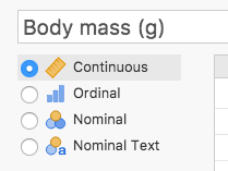
- To change the column names and the kind of variable in the column, double click on the column name. Use column names that will make sense on the final graph, with units as shown below.
- When you are finished, click on those bars again and either Save As (to save in jamovi's file format) or Export (to save as a CSV file).
Graphs
Now make a graph as follows:
- Open your dataset in jamovi by clicking on the bars in to upper left corner and then Open. You will have to navigate to the location of your file but jamovi keeps track of its location and puts it in the Recent list.
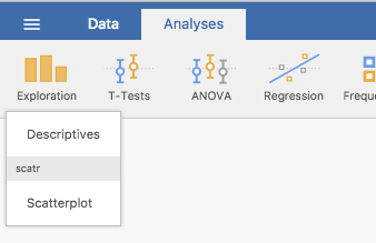
- Under Analyses select Exploration > Descriptives.
- Under Plots, choose the kind of plot you want, put the variables you want to plot into the Variables box and any categorical variable that you want to plot as separate graphs into the Split By box. jamovi will automatically generate the requested graphs in the pane on the right.
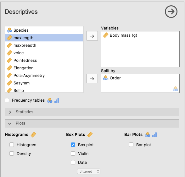
- To change the default appearance of the graphs click on the 3 dots in the upper right corner, and choose the plot theme and other details.
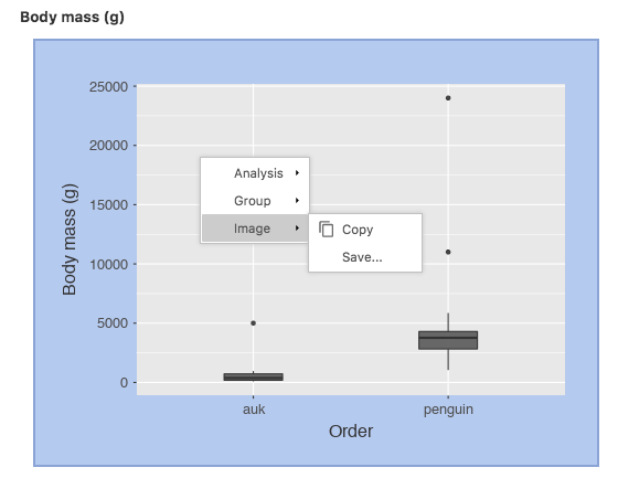
- To copy a graph to your word processor, right (control) click on the graph and choose Image > Copy, then paste it into your word processor. Choose Image > Save to save it as a pdf that you can later import into your word processor as needed.
- To make a scatter diagram choose Exploration > Scatterplot and proceed as above.
Things to Remember When Drawing Graphs
- clearly label the x and y-axes, including units if applicable
- use histograms only to show the distribution of continuous variables
- if you use different symbols or line styles, include a legend to identify what each formatting means
- tic marks are best on the outside of axes, and usually not more than 5-10 are needed for continuous variables
- avoid clutter (you want the most amount of information with the least amount of "ink")
- it is OK to use color and this often makes a graph easier to read; however, color scheme must be colorblind accessible. You should check with your instructor; different people have different opinions on the use of color